Maximizing the effect of your Step and Repeat backdrop
Posted by Sign11.com on 7 /15 /2014
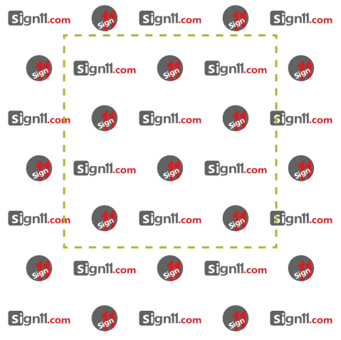
 How should I design my Step and Repeat? What am I looking for in a Step and Repeat? These are the questions you might be asking when you are designing a Step and Repeat. I will introduce you a concept of “Golden Square.” In the picture above, you will notice a golden dotted line. This is the area that you should capitalize on. When you take a picture, you won’t be utilizing the entire banner. Most people are 5′ ~ 6′ in height. And you would be taking a picture in the middle of the backdrop. Consequently, area inside this “Golden Square” is the area that will get most attention in your photos.
So you want the logo/message/image that you want to promote to be placed in this area. If you have two or three logos, you don’t have to worry about this since all the logos will get about the equal amount of attention. Once you start to go beyond three logos, you will notice some logos will not get into the Golden Square as much as others. Especially, if you are having a big event with many sponsors, you want to have your main sponsors in this area. The below is the example of how this works.
You will notice in the picture example, not entire banner is going to show. So remember the “Golden Square” rule as you design your Step and Repeat.
Need Step and Repeat?
Do you need a Step and Repeat? Buy one at our online store: http://www.sign11.com/step-and-repeat/
For any questions, email us at sales@sign11.com
Sign11 Inc. All rights reserved.

